Research process: Making sense of qualitative data
2020-03-14
There are many ways to make sense of research data, but working with qualitative data has its own unique challenges. My experience with qualitative research has involved a lot of mental processing of information and concepts, and I’ve found visualization to be very helpful.
“Qualitative research” means that you aren’t counting things or measuring things on a scale to generate data (which would be quantitative methods). The distinction is less important than the fact that there are some research questions better investigated in this way. One of the practical differences, though, is that computers are a lot better at crunching numbers than they are at interpreting words or images conceptually. Yes, there are computational analysis techniques for text and images—and many ways to quantify aspects of those things—but it doesn’t work for all research questions. At any rate, for my small and in-depth project, I had a database that contained all my data, but I analyzed it myself… as a person.
Over the past few years I collected and analyzed interviews, field notes, technical documents, presentations, websites, and so on. By going through it all and coding the relevant parts, I got an overall sense of what my empirical data looked like. As I got deeper into the analysis, I found myself constantly re-examining the relationships between different pieces of data, between the data and my research questions, and between theory and observations.
Making visual maps of concepts and data was incredibly helpful for making sense of everything. I used the qualitative analysis software package ATLAS.ti to map out key connections. For example, this is one of several maps I made to help understand whether and how the community surrounding the GreenScreen for Safer Chemicals was functioning as a knowledge commons:
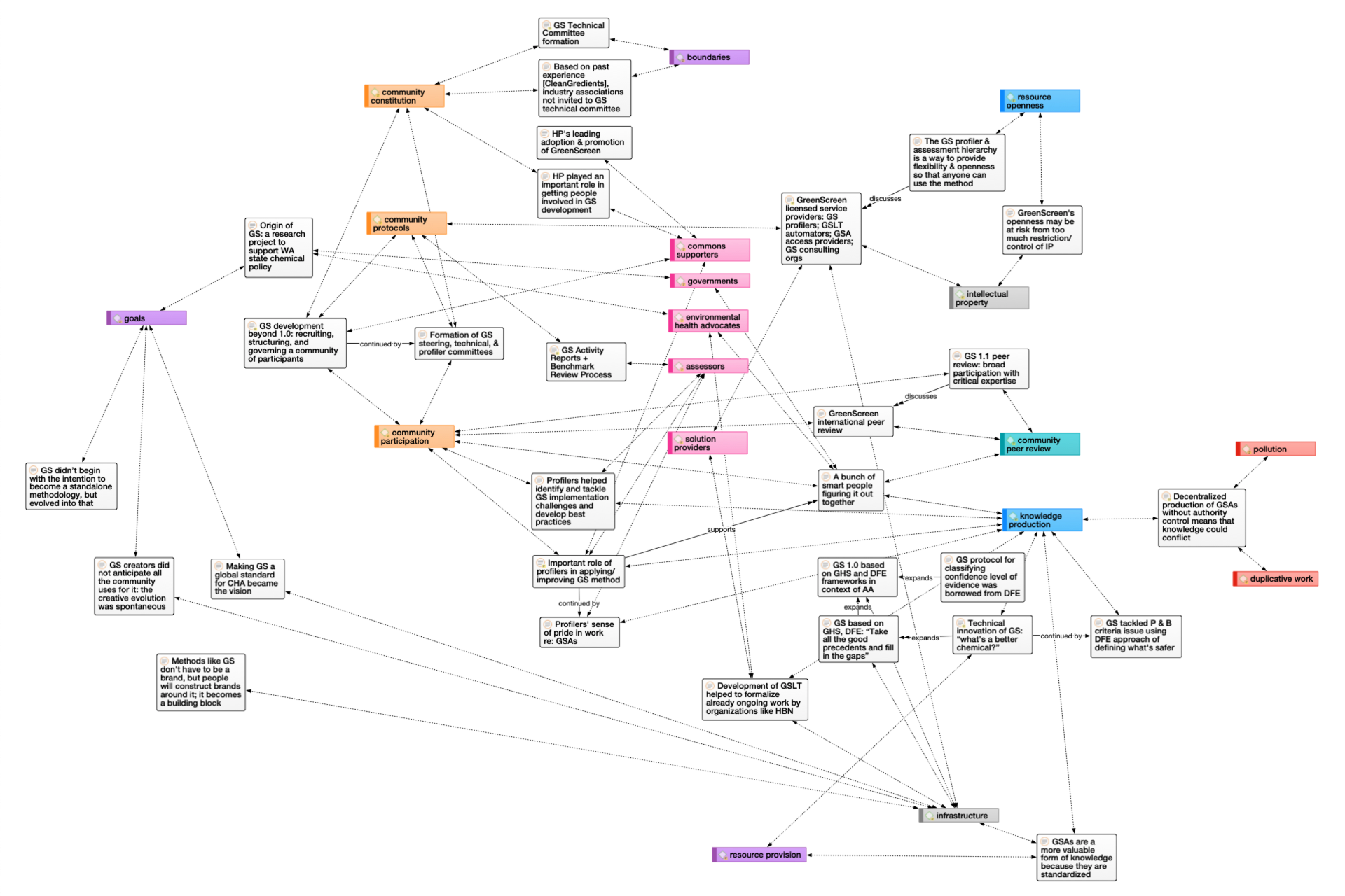
I think network graphs and similar types of visualizations are great, because they can show complex relationships in detail. I ended up also making an interactive network visualization to show how the chemical hazard assessment “knowledge ecosystem” is connected—check it out here. That one was inspired by the much more mind-blowing linked open data cloud diagram. There’s a whole field of theory & techniques for analyzing networks, which I haven’t had the chance to delve into—it seems to bridge between quantitative and qualitative research methods.
But networks aren’t always the best way to analyze or visualize qualitative data. Graphs can be cluttered or hard to decipher (though arc diagrams, chord diagrams, and hive plots are some alternatives). Not all qualitative datasets are even structured like a network in the first place.
The choice of how to analyze and present qualitative research data depends on a lot of factors. Ultimately, though, only one thing really matters: does it make sense?